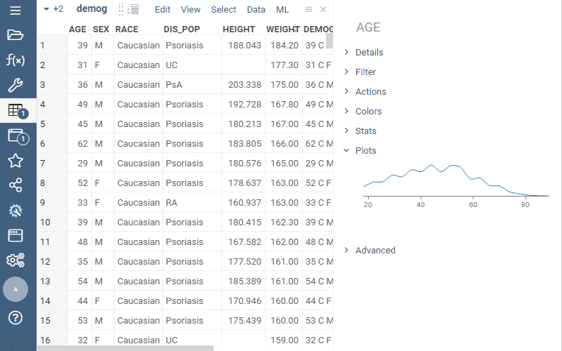
New “Plots” context pane automatically visualized selected columns. For instance, if you have two numerical columns selected, you’ll see a scatter plot. One categorical and one numerical - bar chart and box plot. This can save you plenty of clicks when exploring your data.