Clinical Case is a new application for exploration of clinical data represented in SDTM format.
The main goal of the application is to provide users who deal with clinical trials data (such as bio-statisticians, clinical trial investigators, data scientists, site managers and other groups of users) with an effective, flexible and user-friendly tool which helps to analyze data from different perspectives and on different levels (such as study, site or patient level). Clinical Case provides such capabilities through a number of predefined views with various visualizations. Further we will briefly go through each view and look at its functionality.
You can also refer to a shot introduction video on YouTube.
4 Likes
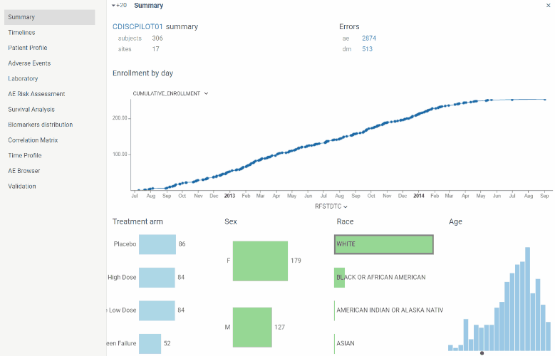
Summary
View contains basic information about the study and subject population.
Here you can find number total number of subjects and sites along with the cumulative enrollment line chart which is useful to assess the enrollment dynamics throughout the study.
‘Errors’ section contains number of errors revealed by validation process in each domain. Validation of SDTM tables (domains) is performed once at the start of application. By clicking on errors number you will be redirected to Validation view.
Also there is a couple of charts with essential population characteristics – age, race, sex, treatment arm – which can be used to assess their distribution within population. Charts are interactive and linked with each other. For instance, by clicking on ‘M’ sex the other charts will show the proportion of male subjects.
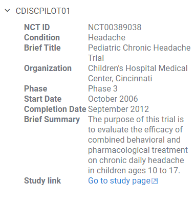
In case trial is registered on clinicaltrials.gov property panel on the right will basic study information extracted from database along with the link to the study on clinicaltrials.gov.
3 Likes
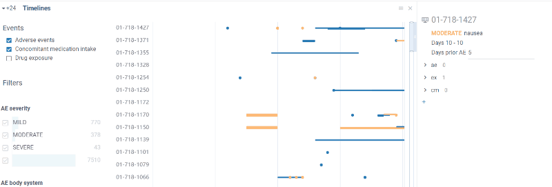
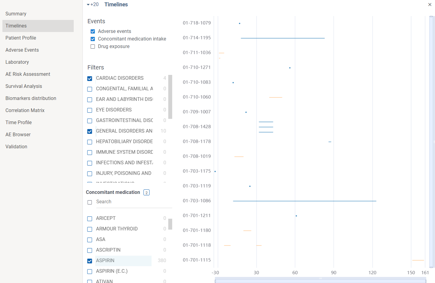
Timelines
Timelines view allows to visualize events flow in time. X axis is time axis reflecting study days. On Y axis there are subjects.
Events are shown either as a point(in case event lased for one day) or as a line (for cases events were prolonged in time)
Adverse events, investigational drug exposure and concomitant medication domains are available for analysis(in case SDTM data contains corresponding tables). Filters can also be applied for each domain.
By zooming in and out you can drill down to particular patient and event or otherwise see the picture of events in general.
Information about particular event is available in tooltip on mouse hover or in a property panel by clicking on event. In case event is an AE you can go to Adverse event browser by clicking on AE name.
Several domains can be shown simultaneously on the graph. For instance, the following screenshot shows severe general and cardiac disorders VS aspirin intake.
2 Likes
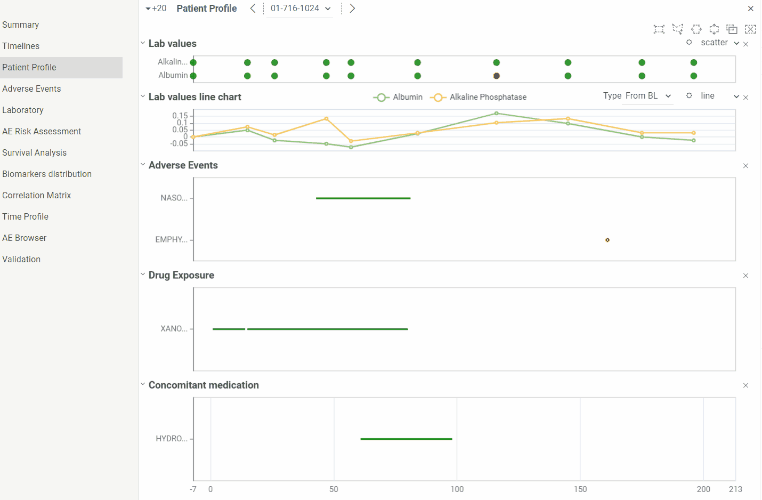
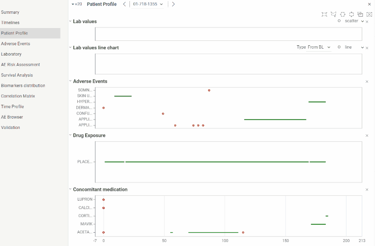
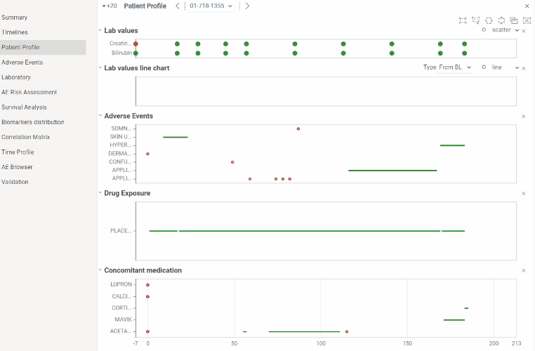
Patient profile
Patient profile is useful for analyzing events related to particular patient.
You can analyze data from laboratory, adverse events, dug exposure and concomitant medication domains in time and see relations between events. All graphs are linked to the same X axis representing study days and it can be zoomed in and out simultaneously.
Information about events is available in tooltips on mouse hover. For convenience graphs can be collapsed or extended.
By clicking on settings button you can choose laboratory values to show on chart. List of available values is extracted from ‘lb’ domain in provided SDTM data.
Values within normal ranges are colored green, values outside normal ranges are red.
You can also choose laboratory values by clicking settings button.
Laboratory line chart provides the following of calculating values dynamics:
-
Relative changes from baseline
-
Relative values between min and max contained in dataset
-
Relative changes between normalized normal ranges
2 Likes
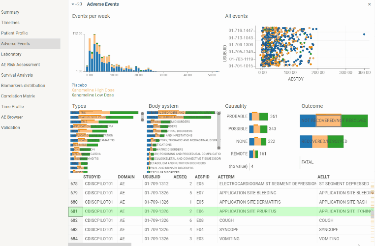
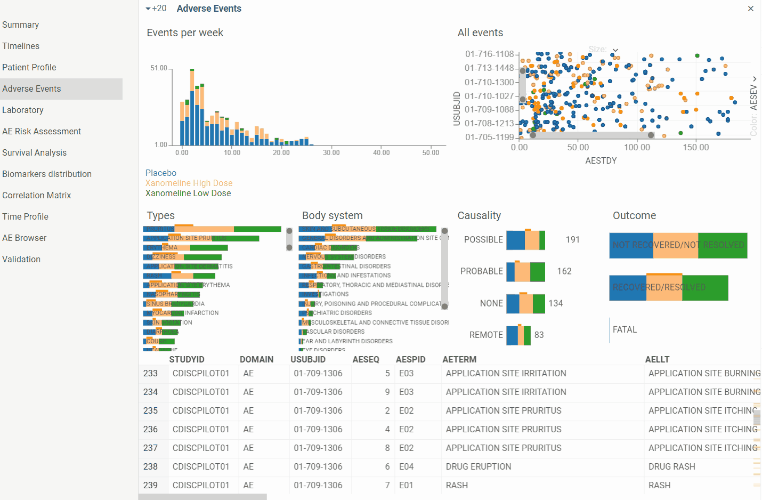
Adverse events
View to explore Adverse events domain. Contains couple of charts along with Adverse events table view.
Plots all adverse events registered during the study. Detailed information is available in tooltip. Also when selecting Adverse event on the plot corresponding row becomes current in Adverse event table. So Adverse event of interest can easily be analyzed in details. Selection also works vice versa - when selecting a row in a table corresponding Adverse event is selected on a scatter plot.
Scatter plot can be zoomed in and out to drill down to particular patient or see picture in general.
Color indicates severity of an Adverse event.
Histogram with number of Adverse events occurred per week throughout the study. Can help to analyze overall dynamics of Adverse events occurrence.
Color corresponds to severity of an Adverse event.
There are barcharts plotting events distribution by Type, Body system, Causality and Outcome.
Color corresponds to treatment arm. So you can visually assess proportion of each treatment group.
Barcharts are also interactive. By selecting one of the groups in a barchart (for instance, adverse events related to study drug for patients who took placebo) corresponding rows will be selected in the table and ‘All events’ scatter plot.
2 Likes
Laboratory
This view contains several specific charts for analyzing laboratory results.
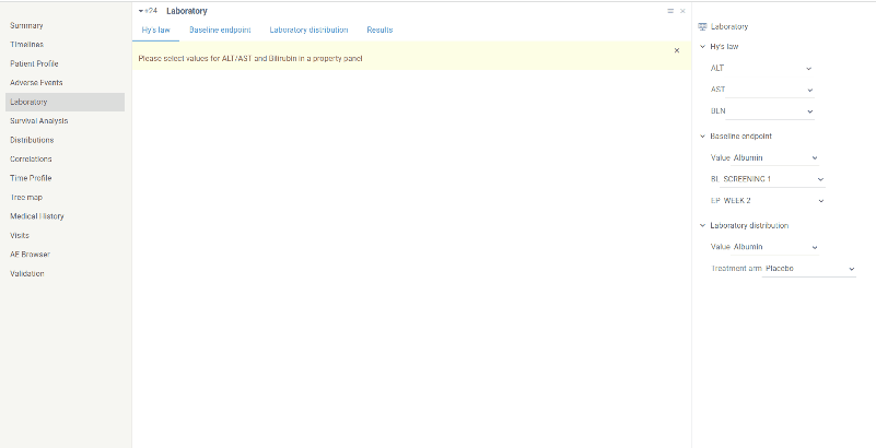
Scatter plot for analyzing possible risk of a fatal drug-induced liver injury. To generate scatter plot you should select values for ALT, AST and Bilirubin on a property panel.
Shows peak bilirubin values versus peak ALT/AST values across the study. Reference lines are shown at 3ULN for ALT and AST and 2ULN for Bilirubin. Possible Hy’s law is defined as AST or ALT >= 3ULN with bilirubin >=2ULN.
Color corresponds to treatment arm.
Scatter plot which shows ratio between laboratory values at some selected baseline and endpoint timepoints.
Scatter plot is divided to 9 parts each of which is annotated with corresponding ration. For instance ‘Normal-High’ quadrant corresponds to subject who had laboratory value within normal ranges baseline visit but ended up with increased value at endpoint. Thus it can be useful, for example, to identify groups of subjects who developed increasing of some laboratory values compared to baseline or vice versa who started with values out of range but ended within normal ranges.
Baseline, endpoint visits as well as laboratory value can be selected using dropdown lists on a property panel.
Color corresponds to treatment arm.
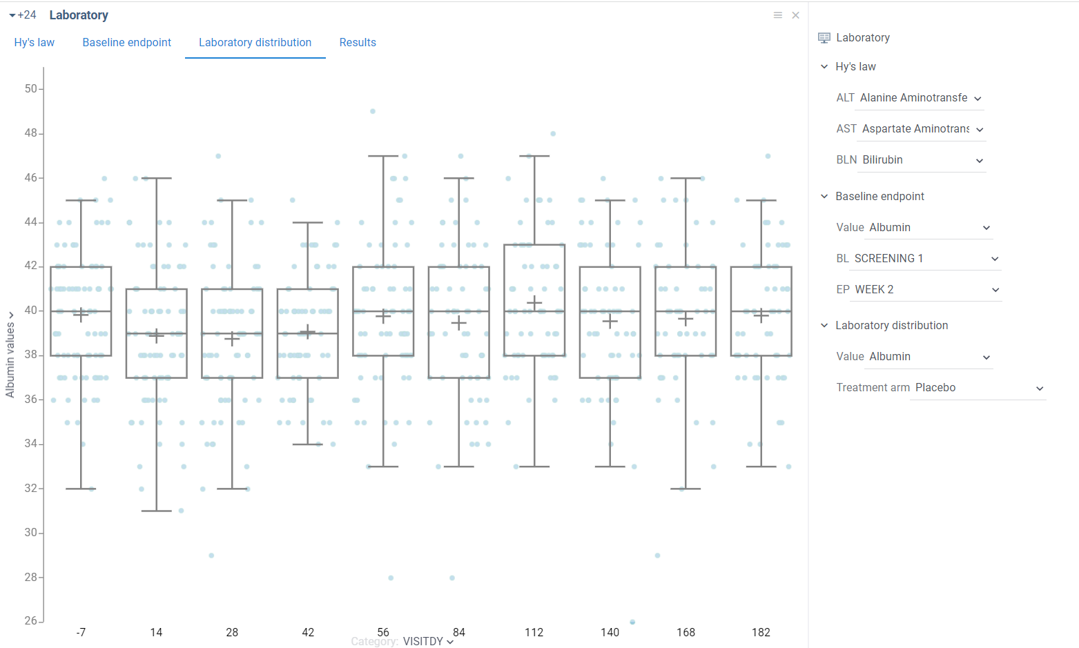
This box plot shows distribution of selected laboratory value among all subjects depending on study day.
In particular you can analyze median, min and max values, upper and lower quartiles and detect outliers. Additionally you can evaluate difference between distributions on different study days.
Laboratory value as well as study visit can be selected via dropdown lists on a property panel.
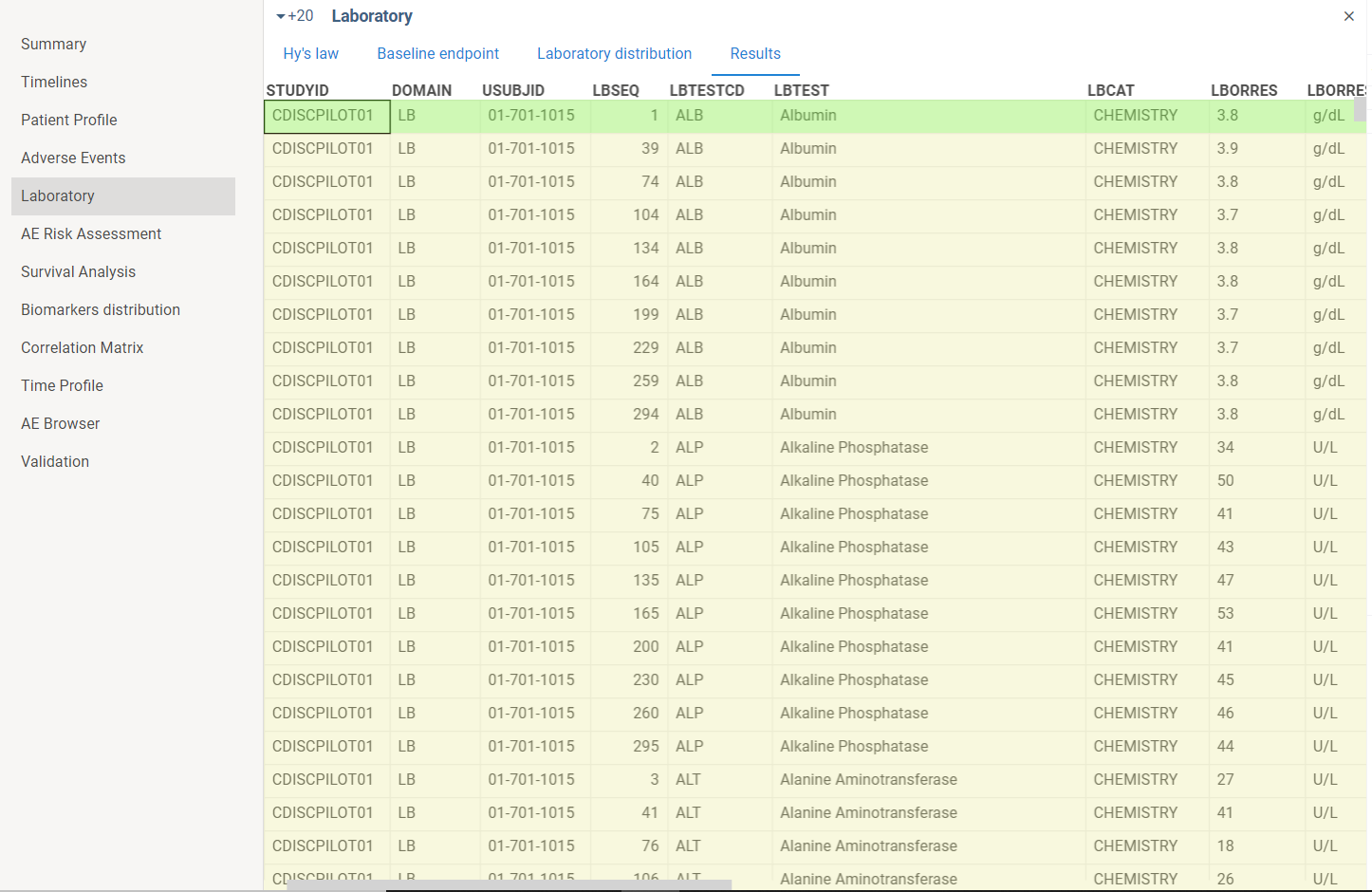
This tab contains laboratory domain table.
1 Like
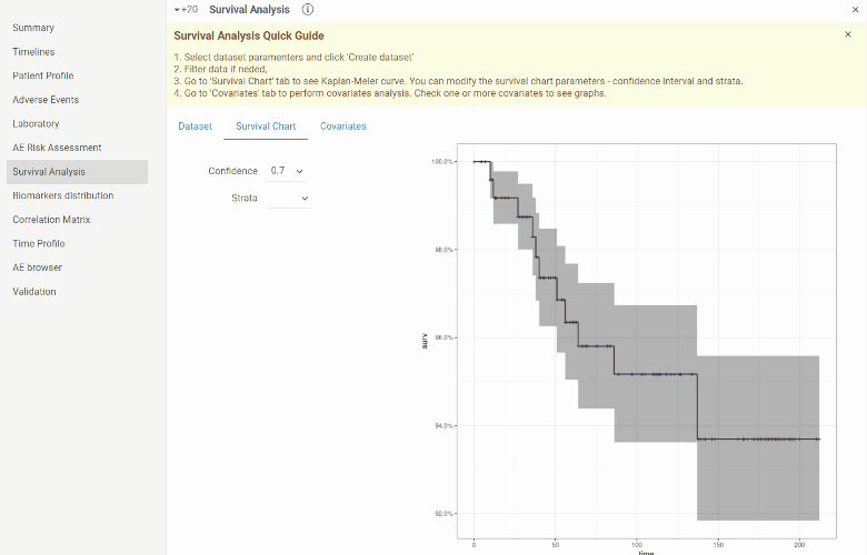
Survival analysis
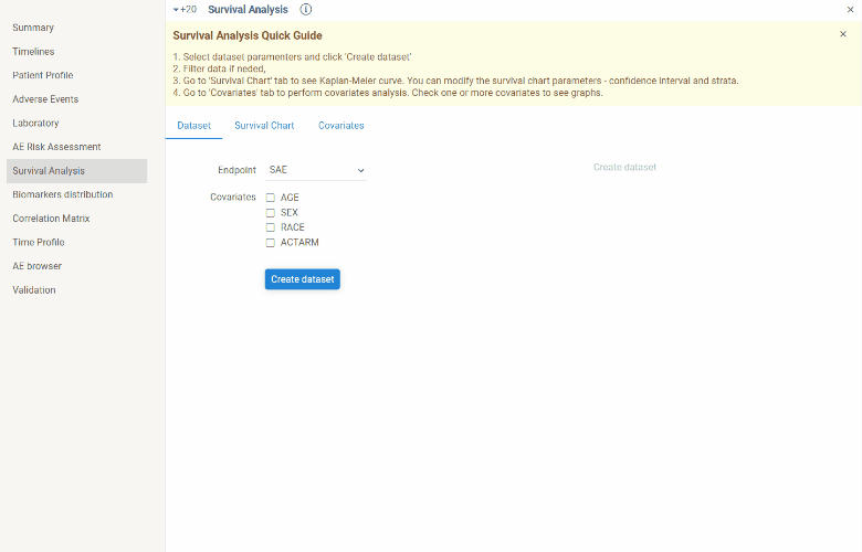
This view is designed to create Kaplan-Meier curves and perform covariates analysis.
Steps to perform survival analysis:
- create dataset (
Dataset tab)
Choose endpoint for which you want to create Kaplan-Meier curve. Optionally you can include basic covariates(age, sex, race, treatment arm) into dataset. Click Create dataset button.
Dataset can be further filtered.
- go to
Survival Chart tab. You will see Kaplan-Meier curve. You can modify confidence interval or choose strata(stratas will be available in dropdown list in case covariates for dataset are selected). After modifying parameters curve will be updated.
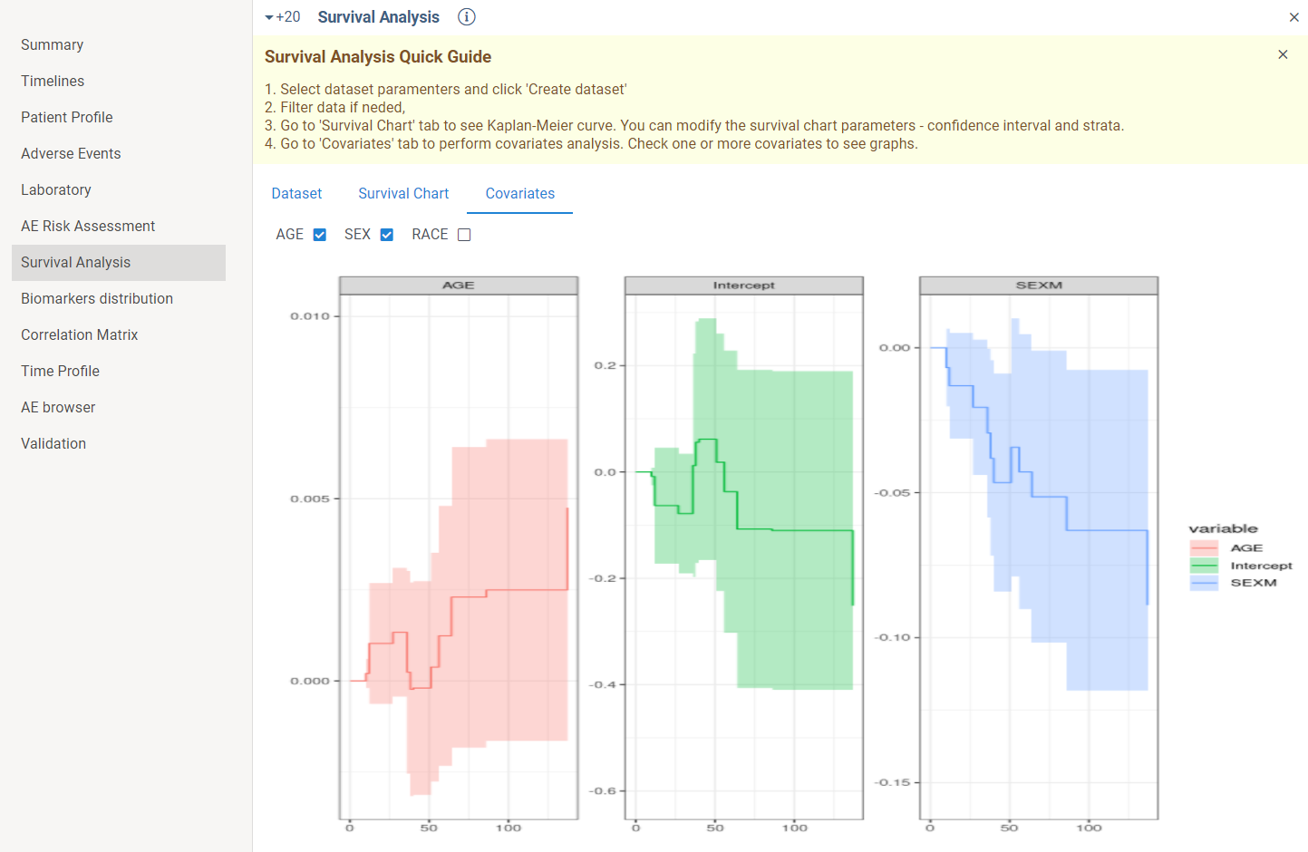
In case you want to perform covariates analysis you should go to Covariates tab and check one or several covariates.
2 Likes
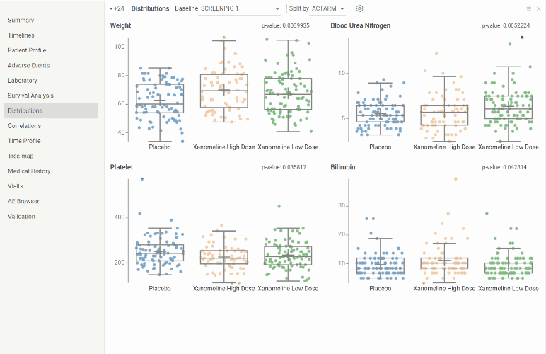
Distributions
The view shows distribution for selected biomarker/vital signs values for all subjects at selected visit splitted by selected parameter. It is useful to evaluate median, upper and lower quartiles and outliers. And since distributions in each boxplot can be grouped by certain parameter it is also possible to evaluate difference in biomarker/vital signs values distribution between different groups.
By default 4 biomarkers with min p-value at the earliest study visit splitted by treatment arm are shown. Baseline visit, split parameter as well as biomarkers can be further changed via dropdown lists and settings button above the boxplots.
2 Likes
Correlations
Correlation matrix shows relations between biomarkers/vital signs values for all subjects at the selected visit.
On diagonal you can see histograms showing biomarker distribution. Cells at the intersection of certain biomarkers contain correlation coefficient for that pair of biomarkers. By hovering mouse over correlation coefficient you will see scatter plot with corresponding biomarkers values in a tooltip.
By default correlation matrix is created for first 20 biomarkers at the earliest study visit. Visit as well as biomarkers can be further changed via dropdown list and settings button above the boxplots.
2 Likes
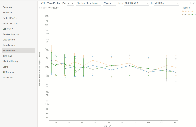
Time profile
This view contains line chart which allows to evaluate laboratory/vital signs dynamics in time. X axis is time axis showing days of study. Y axis is biomarker level scale.
There are 2 types of chart representation:
- Non-normalized biomarkers results
- Relative changes from baseline
Domain, type of graph, value and visits thresholds can be selected in the ribbon panel above chart. Line chart is splitted by treatment arm by default. But parameter to split by can be also changed.
Each value on the graph is represented as distribution. By default points represent median, whiskers represent upper and lower quartiles. Type of distribution can also be changed in property panel.
AE browser
This view is useful for exploring adverse events in details including preceding events from domains other then ‘ae’.
The view is basically ‘ae’ domain table which contains list of all registered adverse events. The table can be filtered.
By selecting row in a table the following information will be displayed on a property panel:
-
subject ID (in a tooltip on mouse hover you will see basic demographic characteristics - age, sex, race, treatment arm)
-
AE name preceded by AE severity
-
Days of study in which AE occurred (in a tooltip on mouse hover you will see real AE dates)
-
input with number of days before AE for which you want to analyze events in other domains (by default it’s 5)
-
list of expandable domain panels which contains rows with events occurred during selected period before the AE (by default adverse event, drug exposure and concomitant domains are selected, but you can add other domains by clicking on + button)
Validation
The view contains results of SDTM tables validation performed at the start of the application.
In the upper table there is a list of violated rules. In the lower table there are tabs with domains in which rules have been violated. Table in each tab contains rows with violated rules.
By selecting a row in the upper table the lower table will be filtered by the selected violated rule.
1 Like
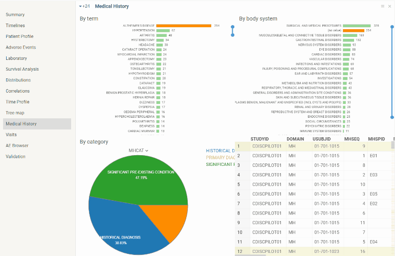
Medical History
The view contains summary of medical history (mh) domain.
There are some pre-defined graphs (distributions of registered conditions by term, body system and category) along with the ‘mh’ table.
As in the other views graphs are interactive and linked.
1 Like
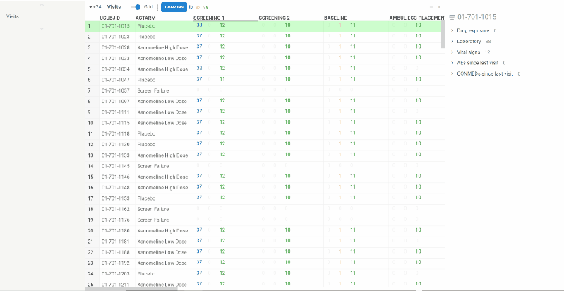
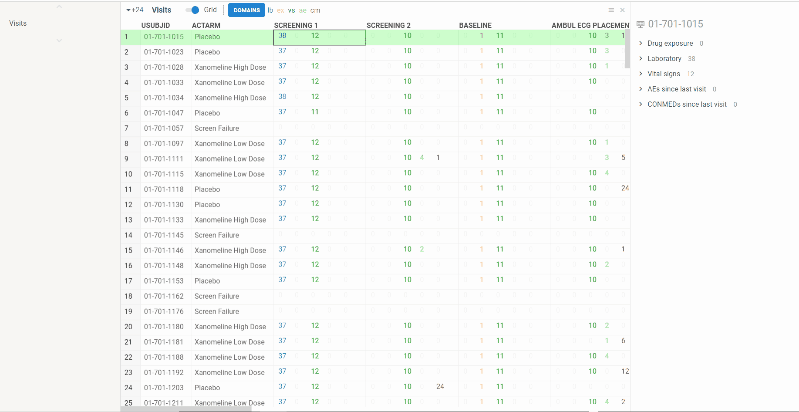
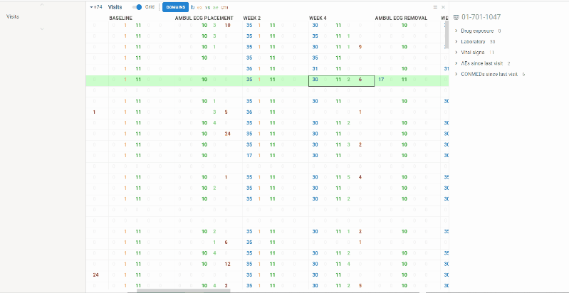
Visits
View contains summary information about all the visits performed in frames of clinical trial protocol (unscheduled visits are NOT included).
Information is represented in two ways:
Columns represent visits, rows correspond to patients. In each cell you will see several numbers of different colors. Colors correspond to domains. On the ribbon panel you can see the names of selected domains. For example ‘lb’ domain is colored blue.
The numbers themselves mean the following:
-
lb and vs - number of values evaluated at the visit for selected subject
-
ex - number of investigational product distributions to selected subject at the visit
-
ae - number of new adverse events occurred since last visit
-
cm - number of new concomitant medication subject took since last visit
The domains can be selected/removed using Domains button on the ribbon panel.
When selecting the cell you will see more detailed information about patient visit in a property panel. There is an expandable panel for each domain which contains rows from corresponding domain table.
When selecting the column the property panel will show study visit summary such as total number of patients, min and max visit dates and some charts representing statistics for different domains:
-
pie chart for investigational product exposure
-
bar charts for new adverse events and concomitant medications since last visit
-
box plots with values distributions for laboratory and vital signs domains
Intensity of color in a heat map represents number of events. Domain can be selected in a drop down list on a ribbon panel.
Map can be sorted by treatment arm.
Selecting cell or column works as in grid regimen - corresponding property panel will appear.
1 Like
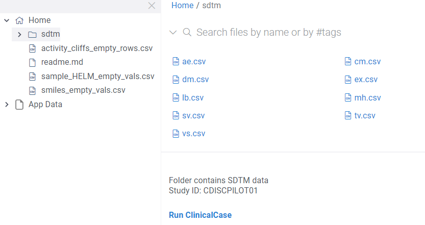
SDTM data detection
Clinical case automatically detects data represented in SDTM format. For instance, if you have a folder containing a bunch of SDTM domains (csv files), you will be offered to launch the application. Also study ID is shown on a panel below files explorer.
Launch the application by clicking Run ClinicalCase.
1 Like