Hi team,
We are facing some issues with the docking system.
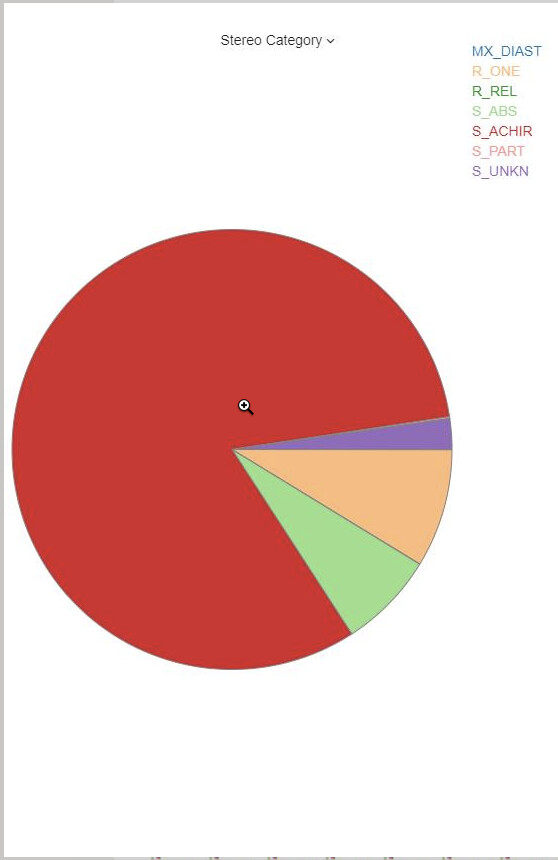
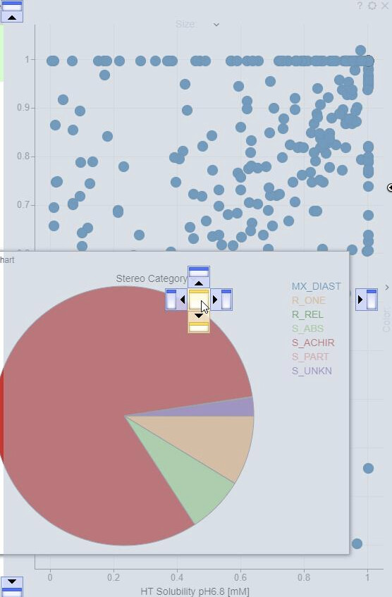
How to identify overlapped visualizations (i.e. how to know that there is a scatterplot underneath the pie chart in the second screenshot)?
1st
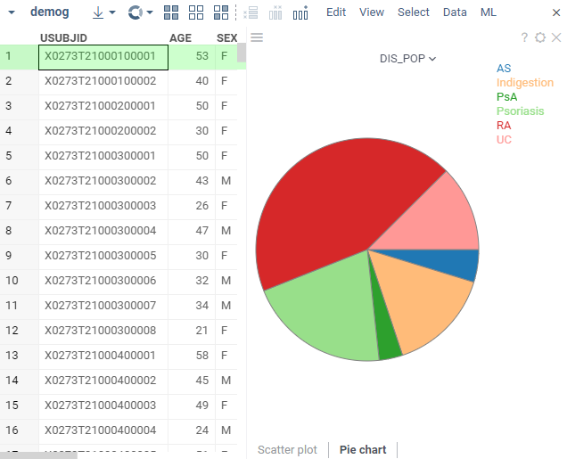
2nd
Hi team,
We are facing some issues with the docking system.
How to identify overlapped visualizations (i.e. how to know that there is a scatterplot underneath the pie chart in the second screenshot)?
1st