Hi team,
Today, I used the Datagrok PieChart to analyze some usage stats.
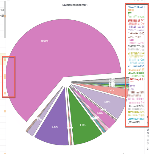
While doing so, I stumbled over a couple of PieChart issues (some cosmetics, but also more blocking issues):
- The chart is cut-off at the left
- The legend is cut-off at the right
- Some segments cannot be marked or hovered to see the tooltip
- I couldn’t find any “order segments by” property (current order seems a bit arbitrary and ordering by size would probably be a good default)
- There is no way to show the legend label on the segment (next to the percentage)
- The option for showing the inner label is inverted (turning it on hides the label, instead of the other way around):

