Hi Team
I played with the Radarplot today and have a bit of feedback (nothing critically urgent):
- In the property panel, when you uncheck “Show Current Row”, it does actually hide the “max” on the plot.
- In the property panel, it says “min” & “max”, but on the plot itself it mentions “5th percentile” and “95th percentile”. Which one is it now?
- Would it be possible to show the values of min & max for each category as labels on the plot? For the min it might be a bit challenging in terms of space, but for the max it could maybe shown close to the category label
Thanks
1 Like
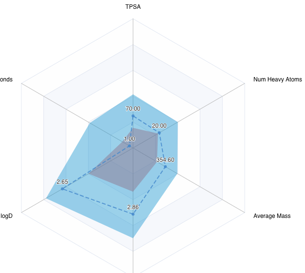
Another thing:
It seems like the axis scaling is a bit arbitrary (or maybe based on a hidden property).
Like in the following case, where none of the properties show a “max” really at the edge of the axis:
What has been used to scale the different axis?
Would it make sense to scale each one individually as you often compare properties with complete different scales (the min and max indicator would then not be necessary anymore)
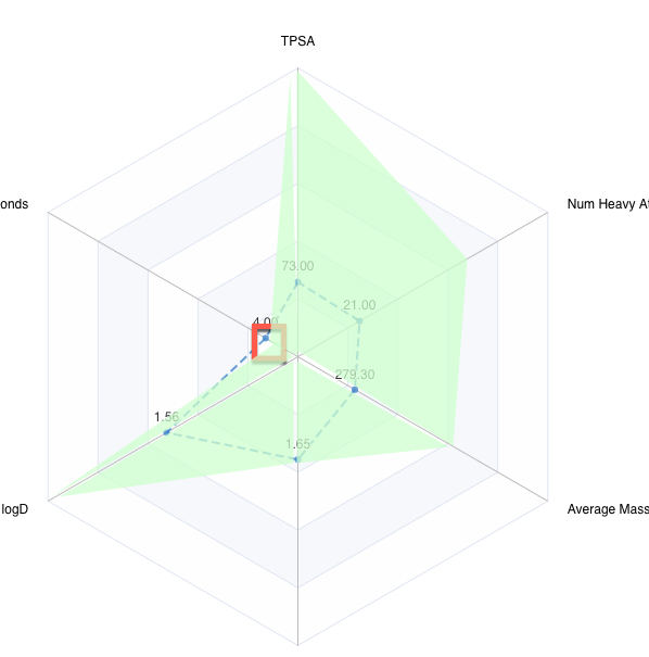
For a future version of the Radarplot, I can imagine defining the “desired” ranges for each category would be really cool.
So that you can e.g. say, for Mol Weight, I want it to be between 250 and 700, for my IC50, between 0.01 and 5, and so on.
The Radarplot would then render a “desired” area for the desired upper and lower values.
That way can easily see for which category your compound falls outside of the desired range.
It would also be great if the properties outside of the desired range would be visually indicated.
Something like this:
Wouldn’t utilizing percentiles be a suitable approach for achieving the desired upper and lower value rendering?
Incorporating visual cues is an excellent suggestion, and we are definitely planning to implement this feature. Thank you for your feedback and ideas!
sorry, I completely forgot to reply to your points.
Regarding the desired range vs percentiles:
Percentiles to just represent the range of data available, but not what is desired.
So as an example, if I have a dataset of car data loaded, which have a gas consumption range of 5-15 l/100km, but my desired range is 5-10, then the percentiles do not help. They just show what cars are on the list, but not what I would like to have and what is outside of this range.
Thank you for the response! We got what you have meant and created an issue a few weeks ago. I’ll reach out to you as soon as I complete the task.