We would appreciate your feedback on the integration of the trellis viewer and row-based sparklines to enable a new type of multivariate analysis.
Trellis plot splits data by categories, and lets you choose a viewer (like histogram, bar chart, or scatter plot) to put in the corresponding cell. This is very useful, but you can only visualize as many columns as the viewer supports.
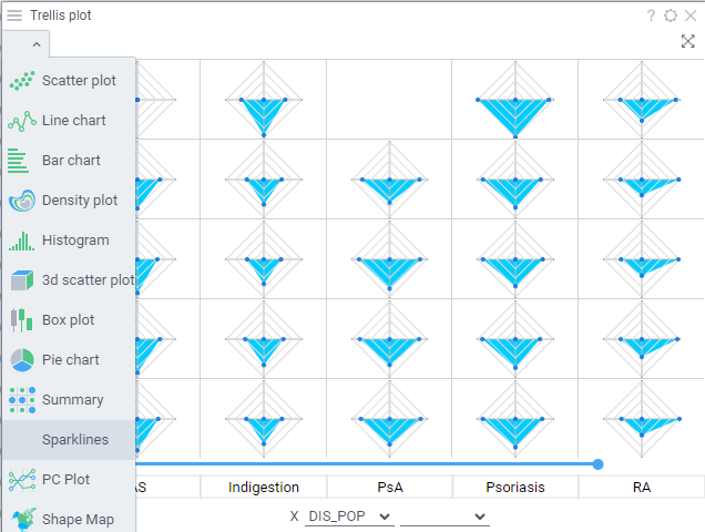
Unlike viewers that work with dataframes, spaklines (examples: radar, lines, pie, bars, summary) visualize many column values in one row. The idea is to combine them with the trellis plot, giving you the ability to select which columns you want to be visualized in a trellis cell, the aggregation function for each of them, and sparkline type.
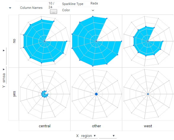
That’s A LOT of work, but I just got the first results to better demonstrate the idea. In the image below, we are visualizing 11 different crime-related attributes, split by the “region” and “smsa” categories. You can clearly see different profiles. A better example would be showing ADME properties but I don’t have a good dataset at the moment
Thanks Andrew! I’ve definitely found users that want to use a Trellis plot but are limited by the choices. Expanding to include more plot types that have greater than 2 dimensions is great.
It’s the selection of the aggregation that I would find most useful. For example, could I select the median(colA), min(colB), and customFunction(colB), and show the raw values in a summary table all split by dimensions of the parent Trellis?
It’s the selection of the aggregation that I would find most useful. For example, could I select the median(colA), min(colB), and customFunction(colB), and show the raw values in a summary table all split by dimensions of the parent Trellis?
You are not going to believe it, as I just discussed exactly this use case with @dkovalyov 20 minutes ago (yes, almost midnight for him, we were that excited :)). He developed the Summary chart some time ago - it is indeed limited in its current implementation, and we are addressing it. Once he is done, we will switch the default Trellis viewer to Summary. In parallel, we are also improving Trellis plot itself to make it as intuitive as possible - you might have noticed already that we’ve rearranged the split selectors, put some additional options on top, etc. It’s shaping up really nicely.