Hi team,
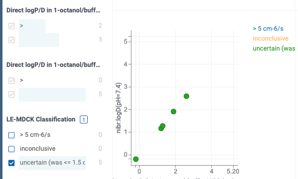
I was playing with the new zoom by filter option and realized that it would be very nice if the “color by” legend would also be updated when filtering data:

You can see that even though I filtered to “uncertain”, the other categories are still appearing in the color legend.
Would it be feasible to expand the “zoom by filter” behavior to the legend as well?
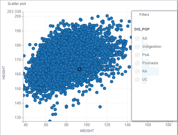
Hi Nico, yes, it’s a good idea, we also thought about it but never had time to implement it. I just had another idea though - how about simply using the column filter control (styled and colored appropriately) instead of the legend? The more I think about it, the more I like the idea - the filter control is very useful, the challenge here is to keep the lightweight appearance
Do you have a mock of that? I’m not sure I fully understand the difference
Like that - but cleaner of course (no labels, no borders, better positioning, custom colors)

ok, that looks nice.
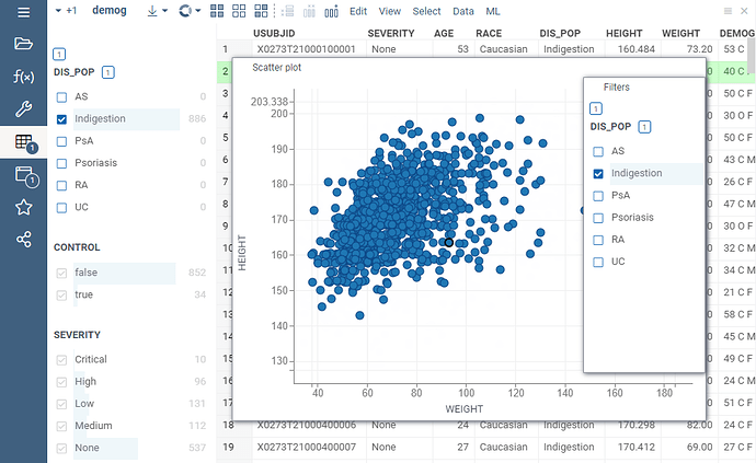
But currently, the categories in the filter panel do not disappear when they are filtered out. So with that proposal we would remain with the same issue I raised in the initial post of this thread, no?
I see that a bit challenging in the original case I was discussing with the user (sorry, but I couldn’t share the original example), where she had more than 30 categories, and the actual struggle was to figure out what is left on the chart after filtering.
She might have the same issue with the proposal above.
Sorry that I didn’t include this detail in the original message.
