Thanks, I confirmed I can change size of molecules. I appreciate your effort.
2 Likes
Hi, Olena
I would like to hear your thought about below topic. Do you think it is worth improving to add new function about visual adustment to regression line?
Final one is regarding the functionality of the regression line in scatter plots. Currently, it is only possible to adjust whether the line is drawn in black or not. Is it possible to change the color or transparency of the regression line in scatter plot? If there is a way to do so, please let me know.
In case of scatter plot with lots of data points, it may be useful to highlight regression line. If datagrok team think it is worth doing, please add it in future.
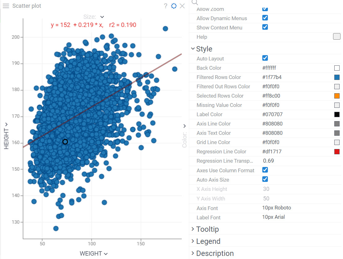
Hi Kosuke, additional regression line options were implemented few weeks ago (this is a core change), and will become available to everyone with the release of the upcoming 1.18 version, which is expected this week.
See “Regression Line Color” and “Regression Line Transparency” on this picture:
2 Likes
Thank you for your note. I might have overlooked it. It’s good to hear we can adjust regression line after next version. I appreciate your effort for quick improvement.
2 Likes
Hi Kosuke,
We implemented the colorMin and colorMax properties in the Scatterplot viewer. I guess the changes will come in the 1.20 version of Datagrok (or in one of the patches if needed).
2 Likes
Sounds great. Thank you for your effort to implement:)