Hi,
I have found serveral potential bugs about visualization, could you please check and solve them, if necessary.
PNG download for Forms
Being able to download images is a strength of Datagrok, but at the moment, there is no download functionality specifically for Forms. It would be great to have an option to right click | General | download as PNG.
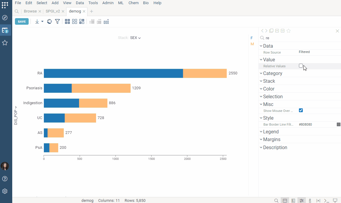
Relative stack value vis in BarChart.
In BarChart display, when Stack gets specified and Relative Values gets checked, the chart does not get stretched to 100% width. It gets done only after Data | Table is changed from empty cell to a certain table.
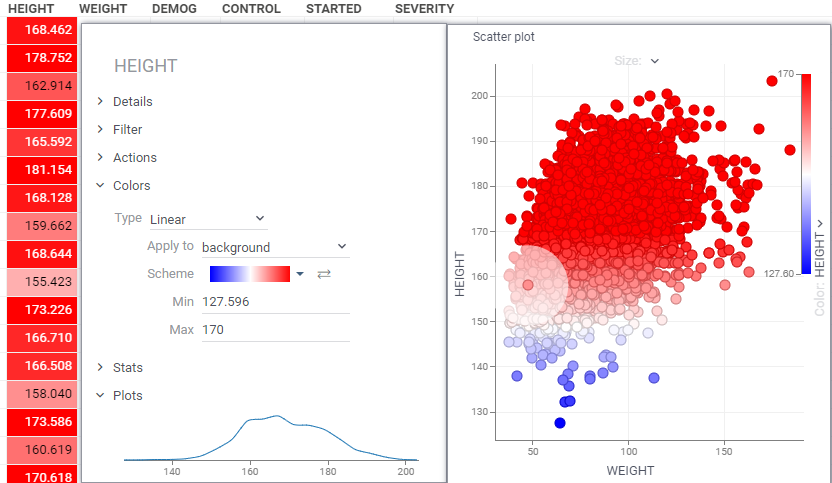
Customizing color schemes for scatter plots: Not good at handling of outliers
Currently, scatter plots only allow selecting color schemes, which means that it does not reflect colors properly when existing extreme outliers. It would be helpful to have options such as setting Min/Max values or color coding based on ranges when specifying numerical columns for color coding.
In Correlation plot tooltip
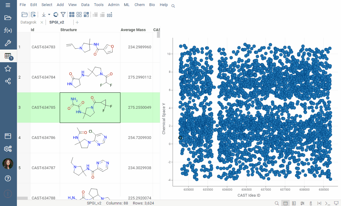
In correlation plot, the parameter names for the x-axis and y-axis in the scatter plot tooltip are not displayed correctly for each cell. However, when double-clicking and opening the scatter plot in a separate window, the names are displayed correctly. Although this is trivial but please check it.
Thank you for bringing these issues to our attention.
We have created several tickets to address the reported bugs, and you can track their status as we work on resolving them:
Forms: implement an option to download as PNG #2652
Hi Olena,
Thank you for sharing gif. It’s easy to understand how to set color in scatter plot. It seems natural to use the same color scheme in both grid and scatter plot.
I appreciate your help.
Best regards,
Kosuke
@kosuketakeuchi0621 - we will add the colorMin/colorMax property to the scatter plot, but you can do what you want already by changing color settings of the corresponding column in the grid:
Hi, I have three topics to ask related to visualization functions.
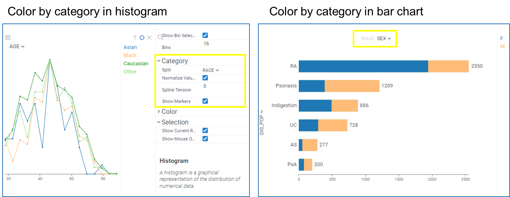
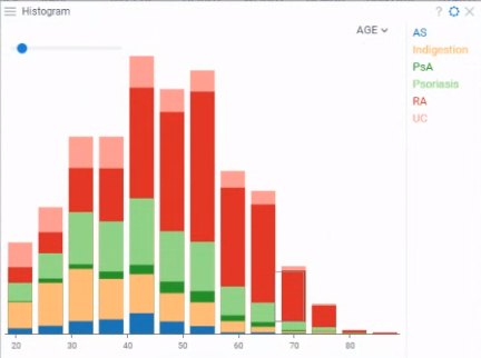
At first, please see attached image, I wonder if you could consider adding a feature regarding category-based coloring in histograms. Currently, in bar graphs, it is possible to implement coloring for each category based on “stack” setting. Would it be possible to also implement this coloring feature in histograms? Currently, coloring in histograms is only done based on aggregated values of numerical data. Although there is “split” setting for displaying categories, it is shown as a line graph. Line graphs are useful in case of comparing individual categories, but category stack coloring would be suitable in case for viewing both the total of each bin and its constituent elements. It would be a useful feature to have. I hope you feel worth trying.
Second, I have a suggestion for a minor adjustment regarding the behavior of pinned columns. Normally, when you left-click on a column name, a panel appears displaying various functions such as Details or Filter for that column. However, when it comes to pinned columns, left-clicking on the column name does not change the panel display, and the Details or Filter options only appear after right-clicking and waiting for a moment. While it is not particularly difficult to operate, I believe it would be less cumbersome if these functions could be accessed with just a left-click. It is not necessarily a critical issue that requires immediate attention, but if possible, please consider making this adjustment.
Final one is regarding the functionality of the regression line in scatter plots. Currently, it is only possible to adjust whether the line is drawn in black or not. Is it possible to change the color or transparency of the regression line in scatter plot? If there is a way to do so, please let me know.
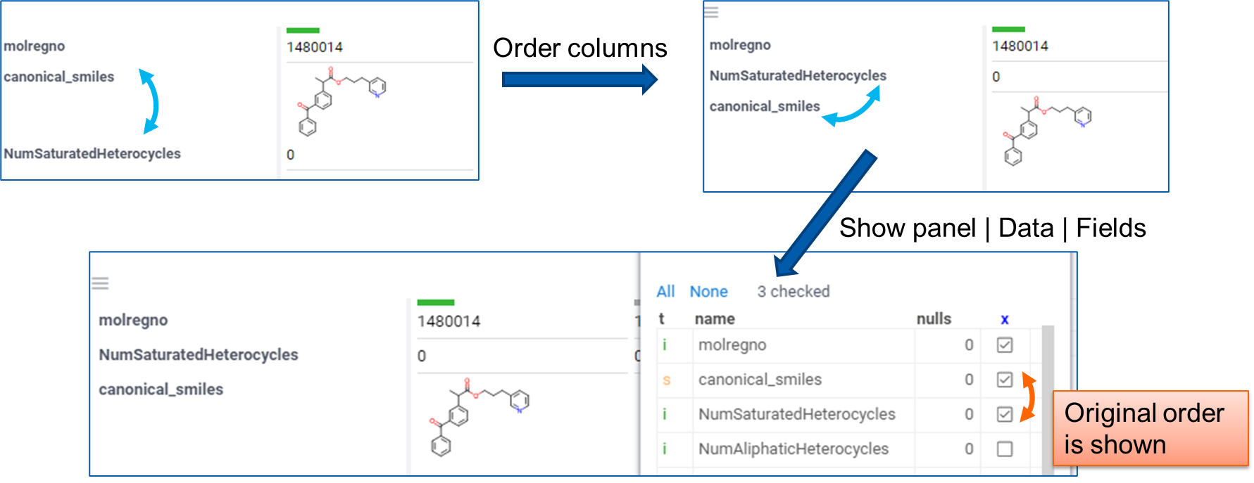
I have two requests regarding the behavior of Forms. The first one is an issue regarding the sorting functionality of Panel | Data | Fields in Forms module. As shown above, it is possible to sort rows, but I noticed that once I sort them and try to sort again, the previously set order is lost. Since it is common to adjust the sorting order multiple times, it would be appreciated if you could consider fixing this issue to remember the latest order.
Additionally, as another request regarding Forms, it would be helpful if we could adjust the size of compound structure image. It would be greatly appreciated if you could also consider this.
Thank you for considering all of suggestions. I appreciate it.
BTW, when it comes to size of compound structure images, structure labels in scatter plot has also room for improvement. Currently, the images can be shown by Labels setting, but their positions and sizes cannot be adjusted. So it would be more user friendly if you could add such options. Besides, if sometimes images are overwrapped so, if possible, clickable function for dragging image to adjust their positions is favorable to have. Or, scattering images function not to stack is another option to achieve.
If you’ have any questions please let me know.
Kosuke
Hi Kosuke, thanks for the feedback! This one is a bit more complex. The scatter plot is not a static image, and at the different zoom levels / viewport optimal label position differ, but we also don’t want labels to jump around when we zoom or pan. We will see what we can do and will update you here.
Just wanted to say that we are working on it. It’s a lot more than just the picture - interactivity also has to be done right, selections, filters, and mouse-over rows also need to be reflected. It will be either in the initial 1.18 release (coming out soon), or in the early patches.
We’ve added an option to adjust the size of the compound structure image in the Forms viewer. This change is now available in the PowerGrid package v1.3.0.
Thank you for considering my request. The image you shared is just what I wanted. Besides, I appreciate your effort for checking whether it acts interactively.