Visualization-related updates

Sharing with you a new extension of the Datagrok platform — the Chord viewer. It visualizes links between categorical data in a circular layout, such as economic flows, gene interactions, or connections in a network. We’ve added a number of sorting and aggregation functions, as well as options for choosing color and direction, and integrated filtering and selection mechanics on par with the platform’s native viewers. The Chord diagram is available both on https://public.datagrok.ai and https://dev.datagrok.ai as part of the Viewers package.

The demo project: https://public.datagrok.ai/p/Donufriienko.ChordDiagram

2 Likes

Default tooltip behavior in the grid has been changed. Now, only the columns that are not visible in the grid get included in the tooltip, making it look a bit cleaner in case when there are not that many columns in a table. This is controlled by the grid’s Show Visible Columns in Tooltip property.

Note that the default tooltip behavior could be overridden by opening the View | Tooltip... dialog, and either selecting columns of interest, or designing a form.

We’ve made drag-and-dropping columns a lot more intuitive and useful by adding the small drop zones for horizontal panning that appear to the left and right of the column headers.

We heard you loud and clear, multi-axis line chart is indeed a very useful feature. We’ve just implemented it, check it out:

We’ve added an ability to using multiple marker shapes in the Scatter Plot.
And now you can define markers not only by color or size but also by a shape.
There are a large number of preset shape of markers. You can also set the size and border thickness for markers.
We can create markers of any specific shape. If there is such a need - let us know.

2 Likes
Good news for anyone who often filters data based on a large number of values!

As you know each categorical filter group has a search field for filtered values. Click the Search icon to the right of the filter caption to open it. This icon appears when you hover the mouse over the filter.

If you start typing text in the field, the filter will show all values ​​that partially contain this text. But if you typing the words, separating them with a comma, then the filter will show only those values ​​that exactly match the each one.

It is also allowed to paste large multi-line text from the clipboard into the search field. In this case, the filter will also display those values ​​that exactly match the each item. To select or deselect only the found values ​​of the category - click the checkbox to the left of the search field. Note that other (not displayed) values ​​of the categories do not change their choice.

Thus, you can quickly and flexibly set filters for a large number of values.

4 Likes

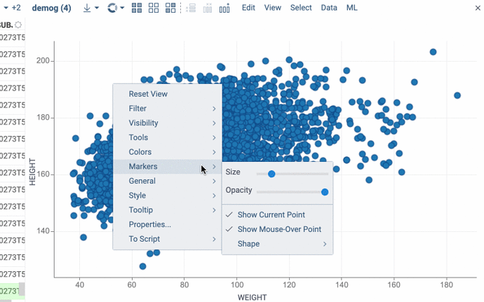
Now it’s more convenient to set the shape of markers.
Just select the icon you want from the popup menu:

2 Likes

Liking the timeline viewer. Is there an ability to add a legend of the event types

1 Like

Thanks, Ed. We’ve added a legend for the ‘Color By’ column, its visibility can be adjusted via ‘Legend Visibility’ property (the auto mode displays the legend when the number of categories doesn’t exceed 100). We are currently testing this and other improvements (version 0.1.0). I’ll write back once it’s available in your environment. The legend functions mostly as in the standard viewers (you can filter by clicking on a category label, etc.)

1 Like

Map viewer

Map viewer shows geospatial data on a map as either markers or a heatmap. It displays data in geographic formats, like GEOJSON, TOPOJSON, KML, and KMZ. You can also add a map viewer to your custom table. When so, it automatically detects columns with longitude and latitude values.

To configure a map, click the Gear icon on top of the viewer and use the info panels on the Context Pane. For example, you can:

  • Color-code points using the Color property.
  • Size-code points using the Size property.
  • Control point size by setting the Marker Min Size and Marker Max Size properties.

To enable a heatmap, use one of the options:

  • On the Layers Menu, turn on the heatmap layer visibility.
  • On the Context Pane, set the Render Type property to heatmap.

A map viewer responds to data filtering and selection. The selected points on a map form a separate layer so you can process them separately. For example, you can export them to a new table, as well as any other layer’s data. To do that, use the corresponding icon on the Layers Menu.

Controls:

Action Control
Zoom in Mouse Wheel Up or Plus
Zoom out Mouse Wheel Down or Minus
Add a point to selection Shift+Click the point
Select multiple points Ctrl+Mouse Drag
1 Like

Added Spline and Fill Spline options that control whether the histogram is rendered as a bar or as a spline (it’s always rendered as spline when the Split column is set), and whether the area is filled or not.

image

2 Likes

More options for histograms in the multi-distribution mode: ability to show markers, and a choice whether or not distributions should be normalized (you compare distributions when “normalize” is on, or absolute values, otherwise).

image

1 Like

New help property introduced for all core viewers. It could be either a markdown, or a URL.

image

1 Like

Text rendering has been significantly improved by introducing smart line wrapping (first by new lines, then by words, then by characters).

grid-text-wrap

1 Like

This is very useful, thanks!

We now render hyperlinks by interpreting any string that starts with http/https as a URL. A tooltip displaying the platform’s response to clicks accompanies these hyperlinks.

URL-renderer

Additionally, we’ve introduced various link-click behaviors, allowing users to choose between “Open in new tab,” “Open in context panel,” or a “Custom” option by defining the “.linkClickBehavior” column tag accordingly. To implement custom behavior, subscribe to the link-click event using the following code:
grok.events.onLinkClicked.subscribe(eventData => grok.shell.info(eventData.args.link));

2 Likes

New options for Histogram to help analyse smaller parts of histogram:
Zoom To Range: show only bins that have values in the set range
Normalize to range: scales values to the biggest visible bin
Bin to Range: bin the data filtered by RangeSlider and not the whole column.

2 Likes

Scatter plot: connecting lines

Now you can set a column that defines order in which points are connected. Below, we see the (gdp, life expectancy) trajectory of different countries over time.