Let’s use this topic for reporting and discussing new visualization-related features.
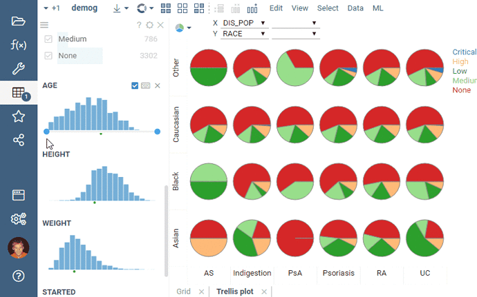
Trellis plot now supports the “row source” property (All / Filtered / Selected / Mouse-over). Not only it will track view’s filter by default, but also it could be used in scenarios involving linked tables.
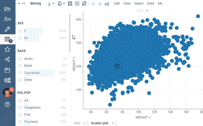
Filters now take advantage of all available space, first expanding as you increase horizontal space, and then switching to the multi-column layout. Thanks @alex.paramonov for this awesome feature!
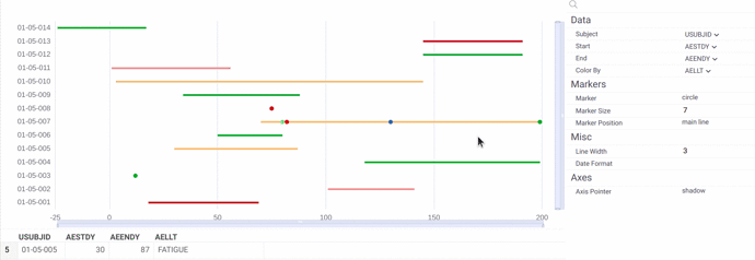
The platform now supports Timelines viewer, which displays the flow of events over time. It is often used in life sciences, for instance, for clinical data visualization. This is why the viewer can choose the start and end parameters by SDTM vocabulary. The first version has a number of other features, such as zoom sliders, marker settings, and automatic selection of the corresponding rows in the dataset. You can try this viewer on dev.datagrok.ai.
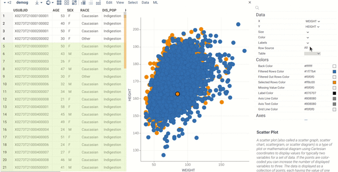
Now it’s possible to select subsets of data to display on scatter plots, since they also support the ‘row source’ property.
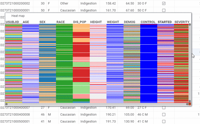
We have improved adaptive rendering of the column names in the heatmap (same behavior in the grid when “Col labels orientation” is set to “Vertical”):
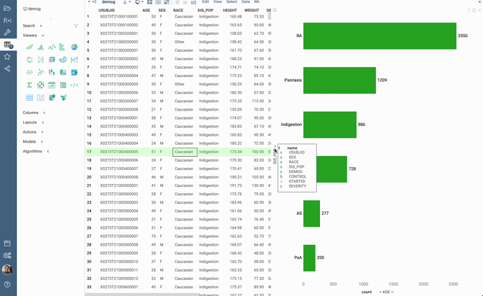
We improved Bar Chart to categorize DateTime columns using functions of Year, Month, Quarter, Year - Quarter, etc.
Multiline values now get flattened in the filters using the “|” symbol. Special support for multi-value cells in filters will be coming as well.

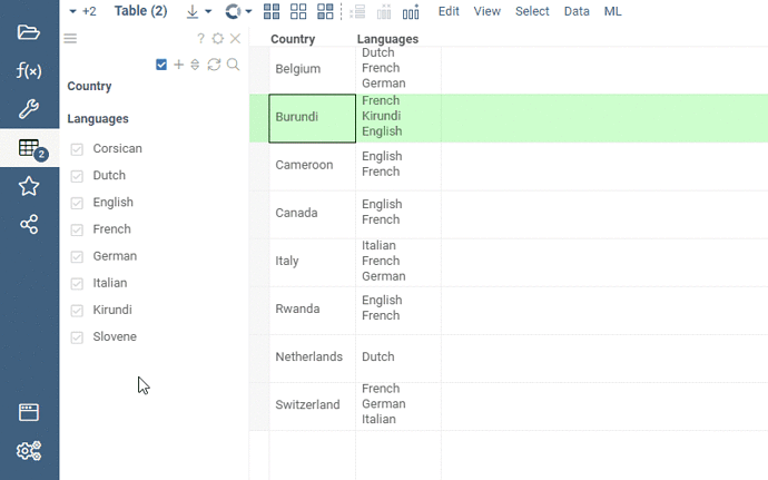
As promised, we have added filtering support for multi-value cells. In order to make the column filter appear this way, simply set the column’s tag to the value separator (you can use ‘\n’ for newline-separated values). You can do it either in the UI, or programmatically:
t.col('languages').setTag(DG.TAGS.MULTI_VALUE_SEPARATOR, '\n');
Check out the script here: https://dev.datagrok.ai/js/samples/ui/viewers/filters/multi-value-filter. A picture is worth a thousand words, and an animated picture is probably worth a bit more:
It is just a first version, and multiple improvements are already planned:
- Automatic detection of the multi-value columns based on the content
- Performance improvements
- Filter / selection / count indicators per category
@asantrosyan.gnf.org @timothy.danford.novartis.com @nikolaus.stiefl.novartis.com @andreas.gasser.novartis.com @gregori.gerebtzoff.novartis.com @nico.pulver.novartis.com @nik.clare.gmail.com
This looks great and will enable many future analysis - thanks a lot.
One question - is this already supporting bar chart plotting of multi-value columns or is that one of your future improvements you refer to?
thanks!
Not yet, bar chart plotting of such columns is a lot more complicated issue, and for a good reason - it’s hard to even define what the desired behavior should be in respect to stacking, color-coding, aggregation functions, etc. I have some ideas about it, but it’s far from a good solution, so let us think a bit more about it.
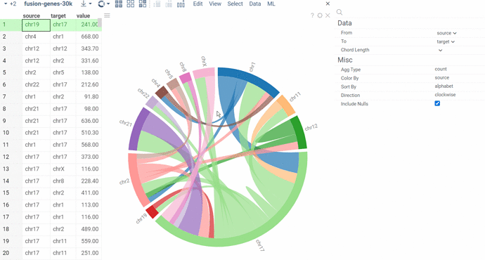
Sharing with you a new extension of the Datagrok platform — the Chord viewer. It visualizes links between categorical data in a circular layout, such as economic flows, gene interactions, or connections in a network. We’ve added a number of sorting and aggregation functions, as well as options for choosing color and direction, and integrated filtering and selection mechanics on par with the platform’s native viewers. The Chord diagram is available both on https://public.datagrok.ai and https://dev.datagrok.ai as part of the Viewers package.
The demo project: https://public.datagrok.ai/p/Donufriienko.ChordDiagram
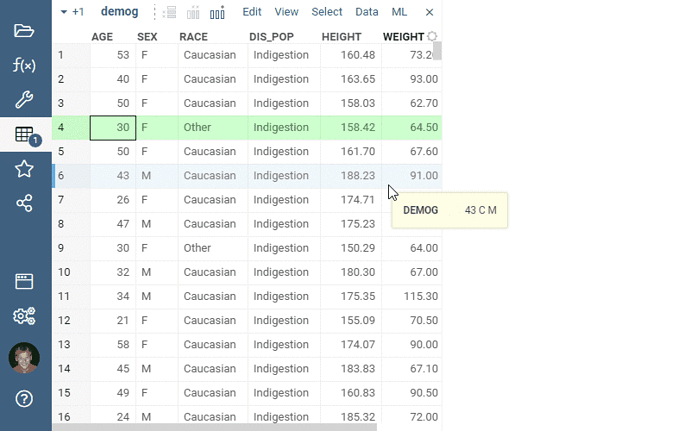
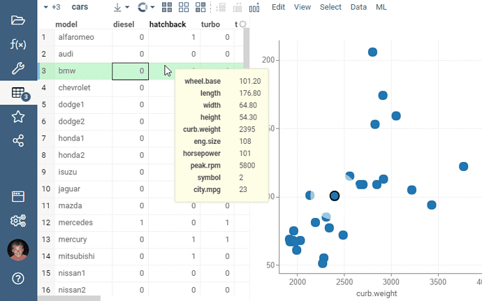
Default tooltip behavior in the grid has been changed. Now, only the columns that are not visible in the grid get included in the tooltip, making it look a bit cleaner in case when there are not that many columns in a table. This is controlled by the grid’s Show Visible Columns in Tooltip property.
Note that the default tooltip behavior could be overridden by opening the View | Tooltip... dialog, and either selecting columns of interest, or designing a form.
We’ve made drag-and-dropping columns a lot more intuitive and useful by adding the small drop zones for horizontal panning that appear to the left and right of the column headers.
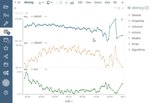
We heard you loud and clear, multi-axis line chart is indeed a very useful feature. We’ve just implemented it, check it out:
We’ve added an ability to using multiple marker shapes in the Scatter Plot.
And now you can define markers not only by color or size but also by a shape.
There are a large number of preset shape of markers. You can also set the size and border thickness for markers.
We can create markers of any specific shape. If there is such a need - let us know.
Good news for anyone who often filters data based on a large number of values!
As you know each categorical filter group has a search field for filtered values. Click the Search icon to the right of the filter caption to open it. This icon appears when you hover the mouse over the filter.
If you start typing text in the field, the filter will show all values that partially contain this text. But if you typing the words, separating them with a comma, then the filter will show only those values that exactly match the each one.
It is also allowed to paste large multi-line text from the clipboard into the search field. In this case, the filter will also display those values that exactly match the each item. To select or deselect only the found values of the category - click the checkbox to the left of the search field. Note that other (not displayed) values of the categories do not change their choice.
Thus, you can quickly and flexibly set filters for a large number of values.
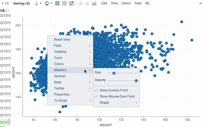
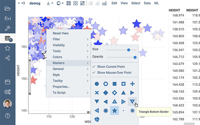
Now it’s more convenient to set the shape of markers.
Just select the icon you want from the popup menu:
