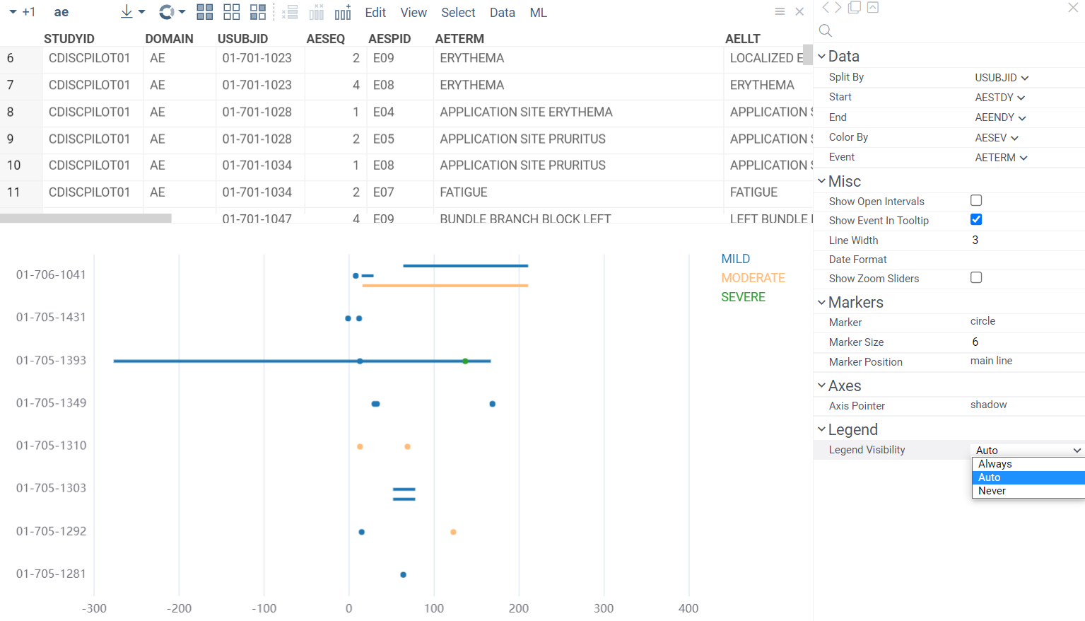
Liking the timeline viewer. Is there an ability to add a legend of the event types
1 Like
Thanks, Ed. We’ve added a legend for the ‘Color By’ column, its visibility can be adjusted via ‘Legend Visibility’ property (the auto mode displays the legend when the number of categories doesn’t exceed 100). We are currently testing this and other improvements (version 0.1.0). I’ll write back once it’s available in your environment. The legend functions mostly as in the standard viewers (you can filter by clicking on a category label, etc.)
1 Like
Map viewer
Map viewer shows geospatial data on a map as either markers or a heatmap. It displays data in geographic formats, like GEOJSON, TOPOJSON, KML, and KMZ. You can also add a map viewer to your custom table. When so, it automatically detects columns with longitude and latitude values.
To configure a map, click the Gear icon on top of the viewer and use the info panels on the Context Pane. For example, you can:
- Color-code points using the Color property.
- Size-code points using the Size property.
- Control point size by setting the Marker Min Size and Marker Max Size properties.
To enable a heatmap, use one of the options:
- On the Layers Menu, turn on the heatmap layer visibility.
- On the Context Pane, set the Render Type property to
heatmap.
A map viewer responds to data filtering and selection. The selected points on a map form a separate layer so you can process them separately. For example, you can export them to a new table, as well as any other layer’s data. To do that, use the corresponding icon on the Layers Menu.

Controls:
| Action | Control |
|---|---|
| Zoom in | Mouse Wheel Up or Plus |
| Zoom out | Mouse Wheel Down or Minus |
| Add a point to selection | Shift+Click the point |
| Select multiple points | Ctrl+Mouse Drag |
1 Like
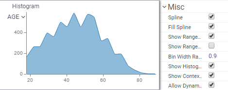
Added Spline and Fill Spline options that control whether the histogram is rendered as a bar or as a spline (it’s always rendered as spline when the Split column is set), and whether the area is filled or not.
2 Likes
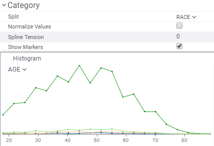
More options for histograms in the multi-distribution mode: ability to show markers, and a choice whether or not distributions should be normalized (you compare distributions when “normalize” is on, or absolute values, otherwise).
1 Like
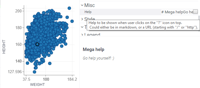
New help property introduced for all core viewers. It could be either a markdown, or a URL.
1 Like
Text rendering has been significantly improved by introducing smart line wrapping (first by new lines, then by words, then by characters).
1 Like
This is very useful, thanks!
We now render hyperlinks by interpreting any string that starts with http/https as a URL. A tooltip displaying the platform’s response to clicks accompanies these hyperlinks.
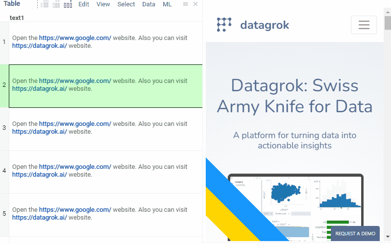
Additionally, we’ve introduced various link-click behaviors, allowing users to choose between “Open in new tab,” “Open in context panel,” or a “Custom” option by defining the “.linkClickBehavior” column tag accordingly. To implement custom behavior, subscribe to the link-click event using the following code:
grok.events.onLinkClicked.subscribe(eventData => grok.shell.info(eventData.args.link));
2 Likes
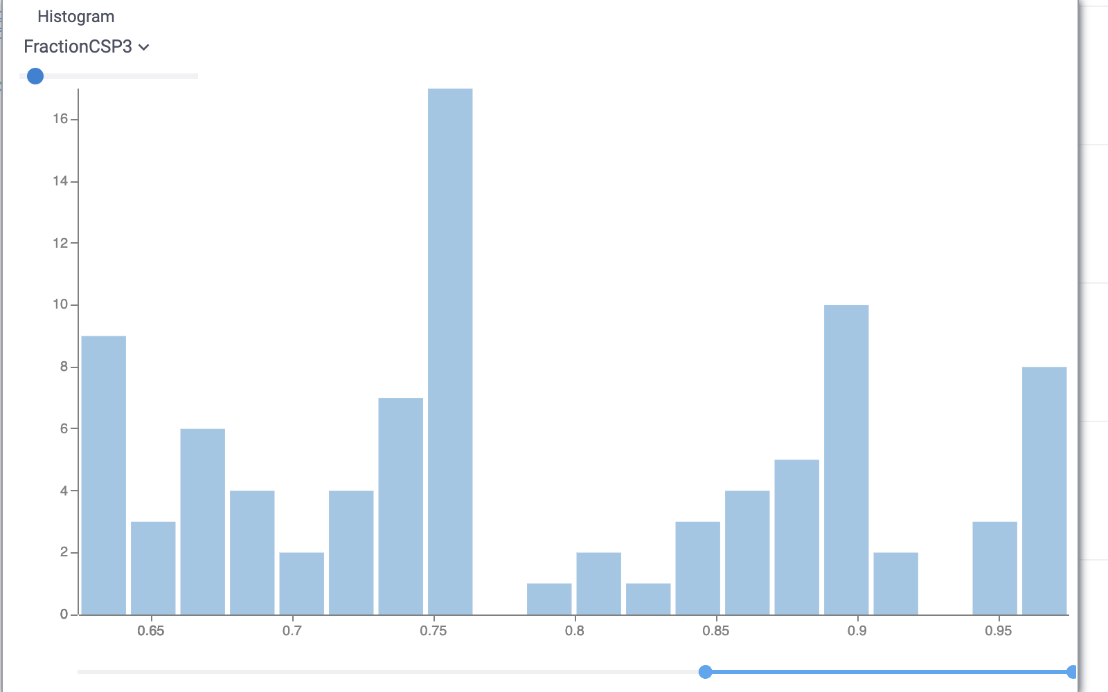
New options for Histogram to help analyse smaller parts of histogram:
Zoom To Range: show only bins that have values in the set range
Normalize to range: scales values to the biggest visible bin
Bin to Range: bin the data filtered by RangeSlider and not the whole column.
2 Likes
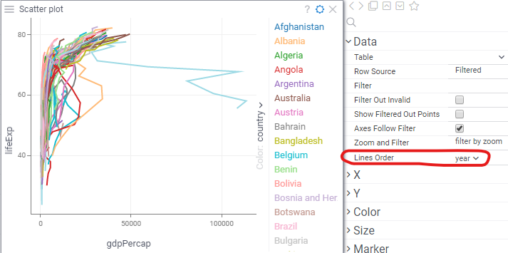
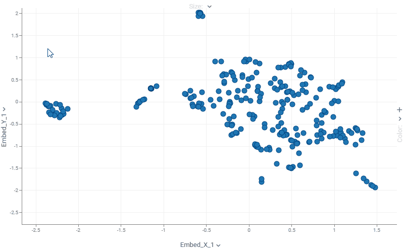
Scatter plot: connecting lines
Now you can set a column that defines order in which points are connected. Below, we see the (gdp, life expectancy) trajectory of different countries over time.
Introducing scatter plot labels!
To show values next to the markers, set the Labels settings either from context menu or from
the properties panel:
- To select columns to show, expand Label Form and check or drag-and-drop columns
- To select a subset of rows to show, use Show Labels For
- You can drag-and-drop labels to exact positions in the Selected or Current modes
-
Use Label as Marker renders centered label instead of the marker. This is
particularly useful for zooming in on molecular datasets (points become molecules). - Check Show Column Names to show column names next to the values
To quickly adjust settings for labels, right-click on the label.
2 Likes
HTML forms in cells
You can create forms in cells based on the arbitrary HTML, with the row values injected using markup. This allows for potentially complex visualizations, including SVG:
Fun fact: The EEG recording in the video above was recorded from Andrew Skalkin’s head while he was helping build JAKE sometime around 2016, back at Johnson & Johnson. Fun times! ![]()
Datagrok is one of the very few web application capable of interactively working with sensor data - you can open datasets with up to a billion data points OR a million columns (not at the same time, of course).
Learn more: Grid | Datagrok
1 Like
Forms viewer improvements
Forms viewer now supports substructure highlighting for molecules and sorting by a specific column. To sort rows directly in the viewer, double-click a column header or use the Sort by option in the Context Panel (see Forms viewer sorting).
Viewer colors, fonts, backgrounds, and alignment now match the grid for a consistent look.
3 Likes
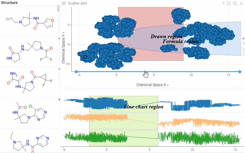
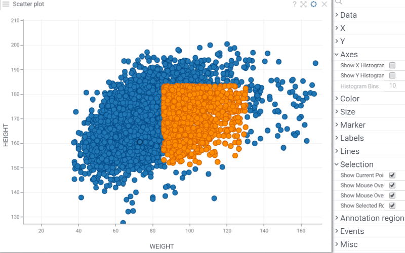
Introducing scatterplot and line chart annotation regions!
Highlight areas of interest and add annotations to them.
Annotation regions support overlapping, data selection, and behave consistently with log scales, inverted axes, and axis transformations.
To add an annotation region, right-click a viewer and go to Tools > Formula Lines…, then click ADD NEW and choose one of the following:
- Region – Formula Lines: define upper and lower boundaries with formulas
- Region – Draw Rectangle: click and drag to draw a rectangle
- Region – Draw Lasso: draw a polygonal region freely
- Annotation Regions History: reuse a previously created region
For Draw Rectangle and Draw Lasso, the viewer enters drawing mode automatically. You can also draw a region directly via Tools > Draw Annotation Region.
Customize regions with a description, fill color, outline, and transparency
See also: scatterplot and line chart documentation.
2 Likes
Other scatterplot updates
We’ve added new options to give you more control over how data is displayed on the scatterplot:
- Show Selected Rows controls whether selected rows are visually highlighted on the scatterplot.
Note: For Row SourcesSelectedandFiltered Selected, color highlighting does not occur, regardless of the Show Selected Rows setting.
- Show X/Y Histograms displays histograms along the scatterplot axes to show the distribution of each variable.
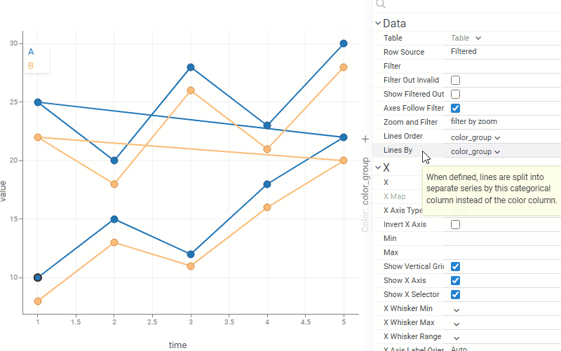
- Lines By: when set, lines are grouped by this column instead of the color column, letting you control line grouping and coloring independently. For example, lines can represent individual patients or experiments while color reflects treatment group or status.
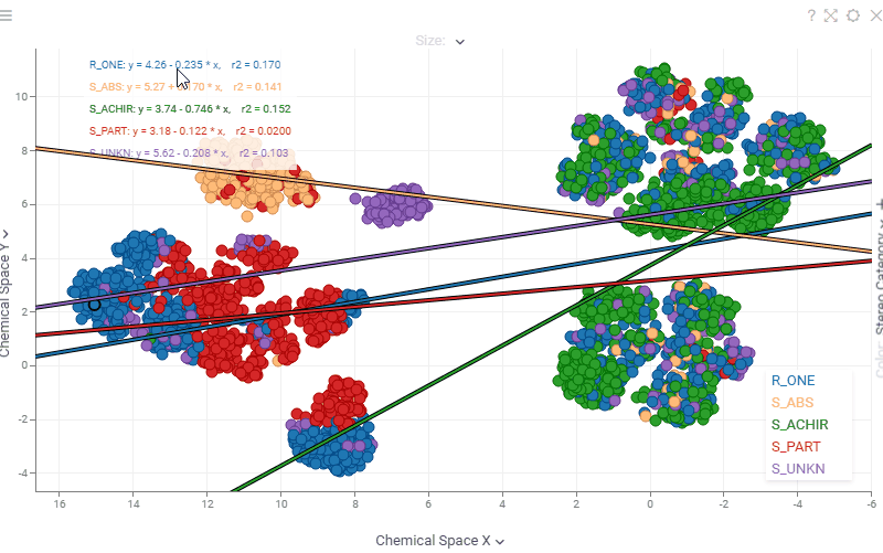
- Scatterplot regression statistics are now interactive. Hover over any statistic (regression equation, r², ρ, r, MAE) to see a tooltip with its description, or click it to open the corresponding Wikipedia page.
1 Like
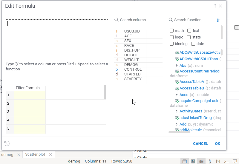
In-viewer Filter
In-viewer filter expressions can now be edited in the new Edit Formula dialog.
This dialog provides the same enhanced experience as Add New Column, including real-time preview, autocomplete, and validation that detects syntax errors, missing columns, and type mismatches. As a bonus, you no longer need to type column names manually — you can select them from a column list.
1 Like
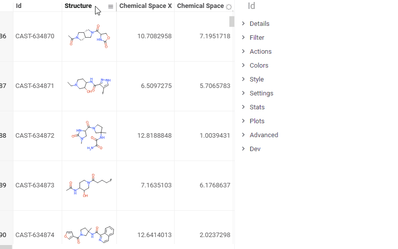
Grid updates
- Color coding schema: Linked. Now you can color code one column by another using the new Linked scheme. This lets you visually correlate columns by reusing the color scheme of a reference column, regardless of the data type of the target column. By default, the first column is used as the reference; you can assign a different linked column in the color-coding settings (Color Coding > Edit…).
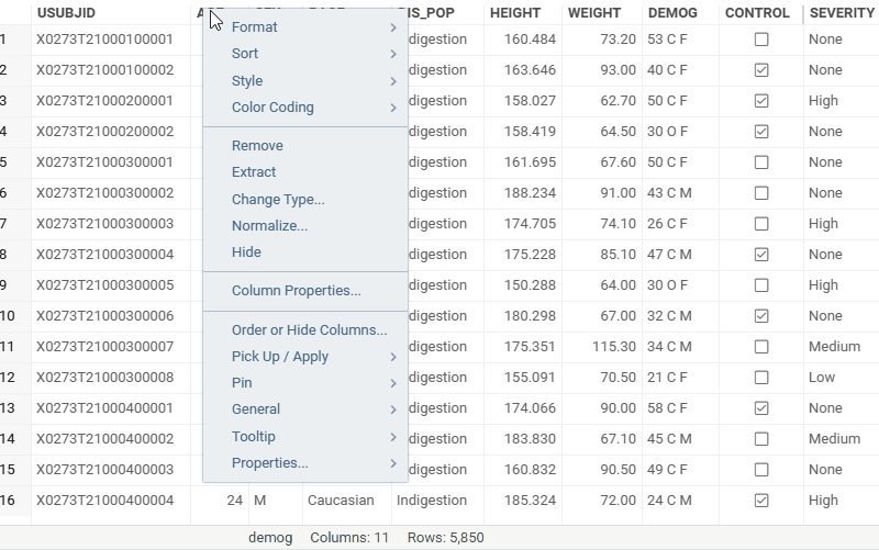
- Blur rendering for columns. You can now blur column values to safely share screenshots in external presentations — sensitive data stays hidden without removing it from the view. To enable, open Context Panel > Settings > Blur content.
- Confidence interval renderer. You can now visualize confidence intervals directly in grid cells. Assign the renderer to a column — it automatically detects matching bound columns based on value ordering. Customize the center mark style, whiskers, reference line, and scale mode (Context Panel > Renderer). For more information, read Grid: Summary columns.
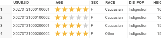
- Stars cell renderer
1 Like