Other scatterplot updates
We’ve added new options to give you more control over how data is displayed on the scatterplot:
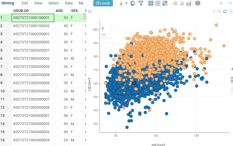
- Show Selected Rows controls whether selected rows are visually highlighted on the scatterplot.
Note: For Row SourcesSelectedandFiltered Selected, color highlighting does not occur, regardless of the Show Selected Rows setting.
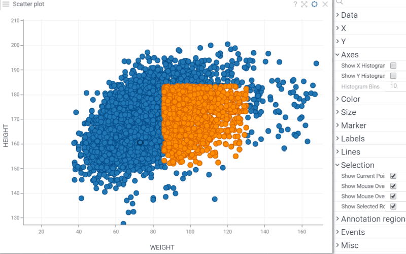
- Show X/Y Histograms displays histograms along the scatterplot axes to show the distribution of each variable.
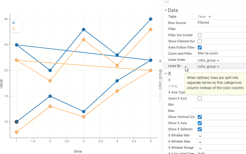
- Lines By: when set, lines are grouped by this column instead of the color column, letting you control line grouping and coloring independently. For example, lines can represent individual patients or experiments while color reflects treatment group or status.
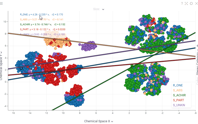
- Scatterplot regression statistics are now interactive. Hover over any statistic (regression equation, r², ρ, r, MAE) to see a tooltip with its description, or click it to open the corresponding Wikipedia page.